Setting up your first PIE
To start creating a PIE, the first step is to create a directory and initialize the project. For the purposes of this explanation, we'll be developing a simple toggle with a value of either true or false.
mkdir pie-toggle
cd pie-toggle
npm init
Using the interactive npm command, set the name of the interaction to pie-toggle, and set the "entry point" to src/index.js. Afterwards, there should be a package.json file in the directory which looks like this:
{
  "name": "pie-toggle",
  "version": "1.0.0",
  "description": "",
  "main": "src/index.js",
  "scripts": {
    "test": "echo \"Error: no test specified\" && exit 1"
  },
  "author": "",
  "license": "ISC"
}
It would also be useful to set up a README at this point:
touch README.md
Creating a Custom Element
To get started, we'll need to create a definition for our PIE custom element in a src directory:
mkdir src
cd src
touch index.js
Fill out this file with the following code:
export default class Toggle extends HTMLElement {

  constructor() {
    super();
    this.innerHTML = [
      '<div>',
        "hello, world",
      '</div>'
    ].join('\n');
  }

}
This defines a simple web component with the content 'hello, world'.
Setting up demo code
Now that we've got some markup in our PIE, we'll need to define an item so that we can see it in action. For a PIE, this is performed by adding data and markup to the demo. You'll want to create a docs/demo directory, and add to it a config.json file as well as an index.html file:
mkdir -p docs/demo
cd docs/demo
touch index.html
touch config.json
At this point, your project structure should look like this:
.
├── docs
│   └── demo
│       ├── config.json
│       └── index.html
├── package.json
└── src
    └── index.js
In the config.json file, we'll need to define the configuration data to set up the PIE:
{
  "elements": {
    "pie-toggle": "../.."
  },
  "models": [
    {
      "id": "1",
      "element": "pie-toggle"
    }
  ]
}
The elements field tells pie where to find the source for a given element using its name. Note that you may also use NPM-style locations for this property as well. The models property defines the content of the various PIE instances to be rendered. At the moment, we're just setting a PIE referenced by id=1 to be defined as a pie-toggle.
Once the PIE is configured in the JSON, we'll need to define the markup for rendering it in the index.html file:
<style type="text/css">
  .body {
    width: 900px;
    margin: 0 auto;
  }
</style>

<div class="body">
  <pie-toggle pie-id="1"></pie-toggle>
</div>
Once this is done, we have the base setup for our PIE.
Running the demo
In order to display our configured PIE in a browser, run the serve task from the docs/demo directory of the project:
pie serve
Then navigate your browser to http://localhost:4000. You should see the "hello, world" message we entered earlier:
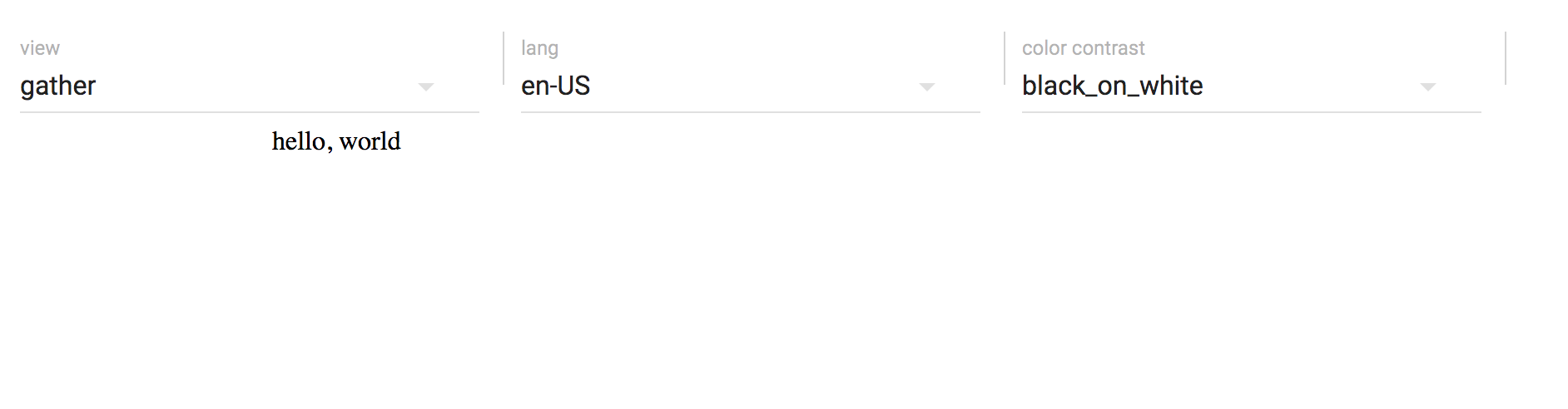
Towards the top of the screen you will see a control panel for changing the view mode, language settings, and color contrast for the item. (This is a subset of the properties that can be set for the environment - a complete set will be coming in an upcoming version of the control panel.)
The pie serve task enables Hot Module Replacement for your code. This means any changes you make in your Javascript code will be automatically updated in the page, you do not need to refresh the page or re-run the task. To try this out, open the src/index.js file and change the hello world message to something else - you will see this is immediately updated on the page.
Adding data to the model
First off, we will introduce logic so that our PIE manages state and provides access to its model and session properties:
export default class Toggle extends HTMLElement {

  constructor() {
    super();
    this._model = null;
    this._session = null;
    this._rerender();
  }

  set model(m) {
    this._model = m;
    this._rerender();
  }

  set session(s) {
    this._session = s;
    this._rerender();
  }

  get session() {
    return this._session;
  }

  _message() {
    return this._model ? this._model.message : 'hello, world';
  }

  _rerender() {
    this.innerHTML = [
      '<div>',
        this._message(),
      '</div>'
    ].join('\n');
  }

  connectedCallback() {
    this.dispatchEvent(new CustomEvent('pie.register', { bubbles: true }));
    this._rerender();
  }

}
There's also a bit of glue code in here so that our component registers itself with the rest of the PIE framework. As you can see, if there is a message property defined in the model it will be rendered into the markup. We'll also need to change the docs/demo/config.json file to include a custom message:
{
  "elements": {
    "pie-toggle": "../.."
  },
  "models": [
    {
      "id": "1",
      "element": "pie-toggle",
      "message": "hello, PIE"
    }
  ]
}
At this point we will also need a controller for our PIE. Create a controller directory in the project root and initialize it using npm with the name pie-toggle-controller and the entry point src/index.js:
Note: the requirement to define an NPM package for the controller is being removed. This will be an optional feature. See Pielabs/pie-cli#85.
mkdir controller
cd controller
npm init
mkdir src
cd src
touch index.js
Paste the following into the controller/src/index.js file:
export function outcome(question, session) {

  return new Promise((resolve) => {
    resolve({});
  });

}

export function model(question, session, env) {

  return new Promise((resolve) => {
    resolve(question);
  });

}
Now open http://localhost:4000, and you will see that the message has now been replaced with "hello, PIE".
Add some interactive elements
At this point, it'll be useful to add some styling and interaction to our PIE. Start with adding the less module to NPM from the root directory of the project:
npm install less --save
Then add the following to src/index.less so that we have some styling for our toggle:
.switch {
  position: relative;
  display: inline-block;
  width: 60px;
  height: 34px;

  input {
    display:none;

    &:checked + .slider {
      background-color: #2196F3;

      &:before {
        -webkit-transform: translateX(26px);
        -ms-transform: translateX(26px);
        transform: translateX(26px);
      }
    }

    &:focus + .slider {
      box-shadow: 0 0 1px #2196F3;
    }
  }

  .slider {
    position: absolute;
    cursor: pointer;
    top: 0;
    left: 0;
    right: 0;
    bottom: 0;
    background-color: #ccc;
    -webkit-transition: .4s;
    transition: .4s;

    &:before {
      position: absolute;
      content: "";
      height: 26px;
      width: 26px;
      left: 4px;
      bottom: 4px;
      background-color: white;
      -webkit-transition: .4s;
      transition: .4s;
    }

    &.round {
      border-radius: 34px;

      &:before {
        border-radius: 50%;
      }
    }
  }

}
After this we'll import the index.less in our index.js file, and add some markup to the _rerender function that displays the switch:
require('./index.less');

export default class Toggle extends HTMLElement {

  constructor() {
    super();
    this._model = null;
    this._session = null;
    this._rerender();
  }

  set model(m) {
    this._model = m;
    this._rerender();
  }

  set session(s) {
    this._session = s;
    if (!this._session.answer) {
      this._session.answer = false;
    }
    this._rerender();
  }

  get session() {
    return this._session;
  }

  _rerender() {
    let checked = this._session ? this._session.answer : false;

    this.innerHTML = [
      '<label class="switch">',
        '<input type="checkbox" ', (checked ? 'checked=""' : ''), '>',
        '<div class="slider round"></div>',
      '</label>'
    ].join('\n');

    this.getElementsByTagName('input')[0].addEventListener('change', (e) => {
      this._session.answer = e.target.checked;
    });
  }

  connectedCallback() {
    this.dispatchEvent(new CustomEvent('pie.register', { bubbles: true }));
    this._rerender();
  }

}
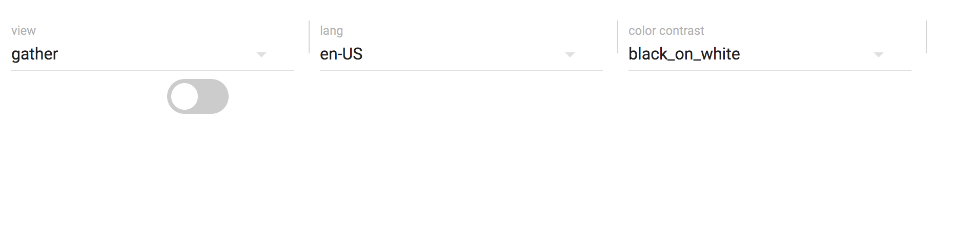
Note also that the addEventListener for changes on the input element will update the PIE's _session to reflect the user's changes. Open http://localhost:4000, and you should now see a toggle component:
Provide scoring from the controller
Replace the outcome function in controller/src/index.js with the following:
export function outcome(question, session) {
return new Promise((resolve) => {
  var correct = (session.answer === question.answer);
  resolve({
    score: {
      scaled: correct ? 1 : 0
    }
  });
});
}
Since this controller logic expects an answer field in the question to specify the correct response, we must also add this information to the model in docs/demo/config.json:
{
  "elements": {
    "pie-toggle": "../.."
  },
  "models": [
    {
      "id": "1",
      "element": "pie-toggle",
      "answer": true
    }
  ]
}
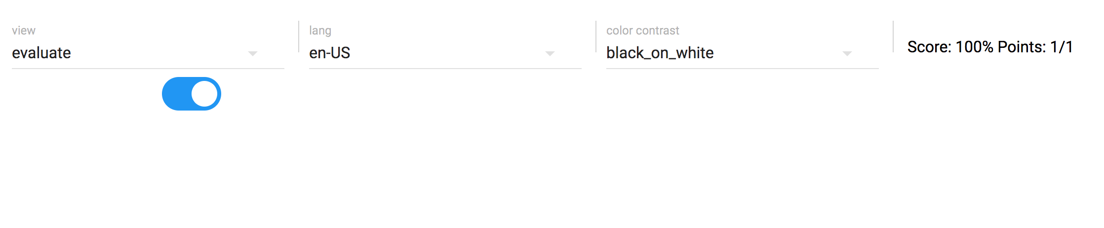
The pie-controller will use the score information to set the score in the demo. On the page at http://localhost:4000, click the toggle, change the view mode to 'evaluate', and you will see the score presented in the UI:
Provide feedback from the controller
We can also use the model function of the controller to provide additional data related to the state of the session as it relates to the question.
Replace the model function in controller/src/index.js with the following:
export function model(question, session, env) {

  return new Promise((resolve) => {
    var response = {};
    if (env.mode === 'evaluate') {
      let correct = session && session.answer && session.answer === question.answer;
      response.result = correct;
      response.feedback = correct ? question.feedback.correct : question.feedback.incorrect;
    }
    resolve(response);
  });

}
As you can see, the model function now looks to see if the view mode is set to evalate, examines the session data to see if the question has been answered correctly, and provides feedback accordingly. In order to provide custom feedback from the question data, we add the corresponding feedback field to the model defined in docs/demo/config.json:
{
  "elements": {
    "pie-toggle": "../.."
  },
  "models": [
    {
      "id": "1",
      "element": "pie-toggle",
      "answer": true,
      "feedback": {
        "correct": "Correct!",
        "incorrect": "Incorrect!"
      }
    }
  ]
}
Now that the model contains a feedback field, we will need to update the src/index.js that renders the PIE in the UI to display this field to the user. Modify the _rerender function to look like this:
_rerender() {
  let feedback = (function(model) {
    if (model && model.feedback) {
      return [
        "<div class='feedback'>",
          model.feedback,
        "</div>"
      ].join('\n');
    } else {
      return "";
    }
  }(this._model));

  let checked = this._session ? this._session.answer : false;

  this.innerHTML = [
    '<label class="switch">',
      '<input type="checkbox" ', (checked ? 'checked=""' : ''), '>',
      '<div class="slider round"></div>',
    '</label>',
    feedback
  ].join('\n');

  this.getElementsByTagName('input')[0].addEventListener('change', (e) => {
    this._session.answer = e.target.checked;
  });
}
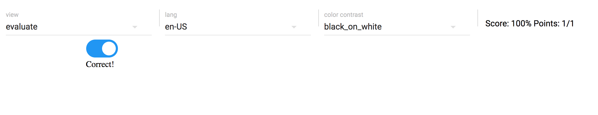
On the page http://localhost:4000, click the toggle, change the view mode to 'evaluate', and you will see the feedback presented in the UI:
Debugging
When running pie serve The Element and Controller code for your PIE is transpiled and added to a file called pie-item.js. You can inspect this file with your browser debugger.
Coming Soon: The
pie-item.jsfile is transpiled to ES5 from your sources. Source maps feature will be added topie servetask, so your ES6 files can be inspected directly in a compatible debugger.